Seems there is a real problem ;-) even with valuable SO comments at hand. In the first instance I tried to float all divs. But even when clearing floats this always left a vertical gap. In a second attempt, I used a table but this wasn’t really responsive design. Next, I tried CSS3 multi-column layout
#container {
    margin: 0 auto;
    column-count: 3;
    column-gap: 2px;
    width: 320px;
    background-color: white;
}
This works as expected (jsfiddle).
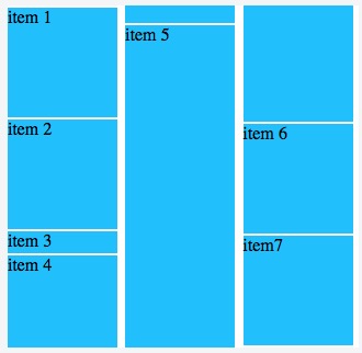
and could be even responsive when adding some code for smaller screens
@media screen and (max-width: 1450px) {
  #inner {
    max-width:950px;
    margin: 0 auto;
    -moz-column-count: 2;
    -webkit-column-count: 2;
    column-count: 2;
  }
}
@media screen and (max-width: 950px) {
  #inner {
    max-width:480px;
    margin: 0 auto;
    -moz-column-count: 1;
    -webkit-column-count: 1;
    column-count: 1;
  }
}
jsfiddle looks great but we are soon running into another problem. Whenever adding more divs as the database is updated, the whole layout gets re-arranged column-wise which is very confusing to the viewer. The same happens with flexbox (attempt #4), currently there is no CSS solution at all. You need some JS layout cheating (codepen).