Infectious trees have common elements with pedigree plots in genetics.
Except of the “star bus” plot, all have a time frame. Maybe the main differences is the time frame, which was always horizontal except of the “vertical” Lancet plot (although ut wasted a lot of space by unused lines).
“Railways” is more abstract art and too much condensed to be useful, “exploding stars” gets immediately busy making changes dfficult. “Tree Addons” is nice and should be possible when plotted in landscape format.
We could juts use some phylogenetic tree package which may be hard to configure for this special purpose. So lets try some new version of the recent Lancet figure.
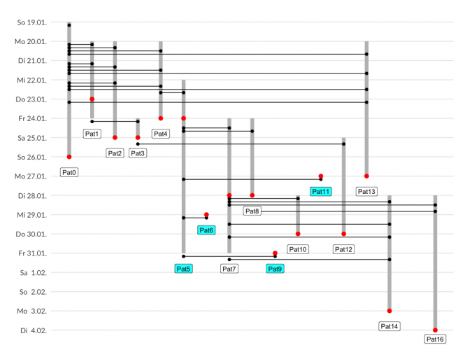
- each individual gets an increasing id which is a unique x-axis value
- time points are on a revere y-axis
- crossing lines indicate interaction
- different symbols indicate actions
events <- read.xlsx("test.xls", startRow = 1, colNames = TRUE, rowNames = FALSE, detectDates = TRUE, skipEmptyRows = TRUE, skipEmptyCols = TRUE, rows = NULL, cols = NULL, check.names = FALSE) %>%
  mutate( dt = yday(dt) ) %>%
  arrange( dt,id,id2 ) %>%
  group_by( dt ) %>%
  mutate( nr = (row_number()) /6 )
ids <- events[,c("id","dt","nr","event")]
cnd <- !is.na(events$id2)
ids[dim(ids)[1]+1:sum(cnd),] <- events[cnd, c("id2","dt","nr","event")]
ids <- ids %>%
  group_by( id ) %>%
  mutate( mindt=min(dt), maxdt=max(dt) )
events %>%
  ggplot() +
  geom_segment( data=ids %>% filter(row_number()==1), aes(x = id, y = mindt, xend = id, yend = maxdt), size=3, colour="grey") +
  geom_segment( aes(y = dt+nr, x = id, yend = dt+nr, xend = id2), colour="black" ) +
  geom_point( data=ids %>% filter(event!="S"), aes(y=dt+nr, x=id), size=2, colour="black") +
  geom_point( data=. %>% filter(event=="S"), aes(y=dt, x=id, group=id ), shape=21, fill="red", size=3, colour="red") +
  geom_label_repel( data=ids %>% filter(row_number()==1 & !id %in% c(5,6,9,11)), aes(y=maxdt, x=id, group=id, label=paste0("Pat",id) ), nudge_y=-.8, nudge_x =.001, segment.color = NA, force=10) +
  geom_label_repel( data=ids %>% filter(row_number()==1 & id %in% c(5,6,9,11)), aes(y=maxdt, x=id, group=id, label=paste0("Pat",id) ), fill="cyan", nudge_y=-.8, nudge_x =.001, segment.color = NA) +
  scale_y_reverse ( limits=c(35, 19), breaks=seq(35,19,-1), labels=format( as.Date( c(34:18), format = "%j", origin="1.1.20"), "%a %e.%m." ), name="") +
  scale_x_continuous( position = "top", name="" )
All Code is at Github.
And here is my plot, trying to increase “data ink”. I think it is most suitable for up to 20 individuals and detailed contact history.