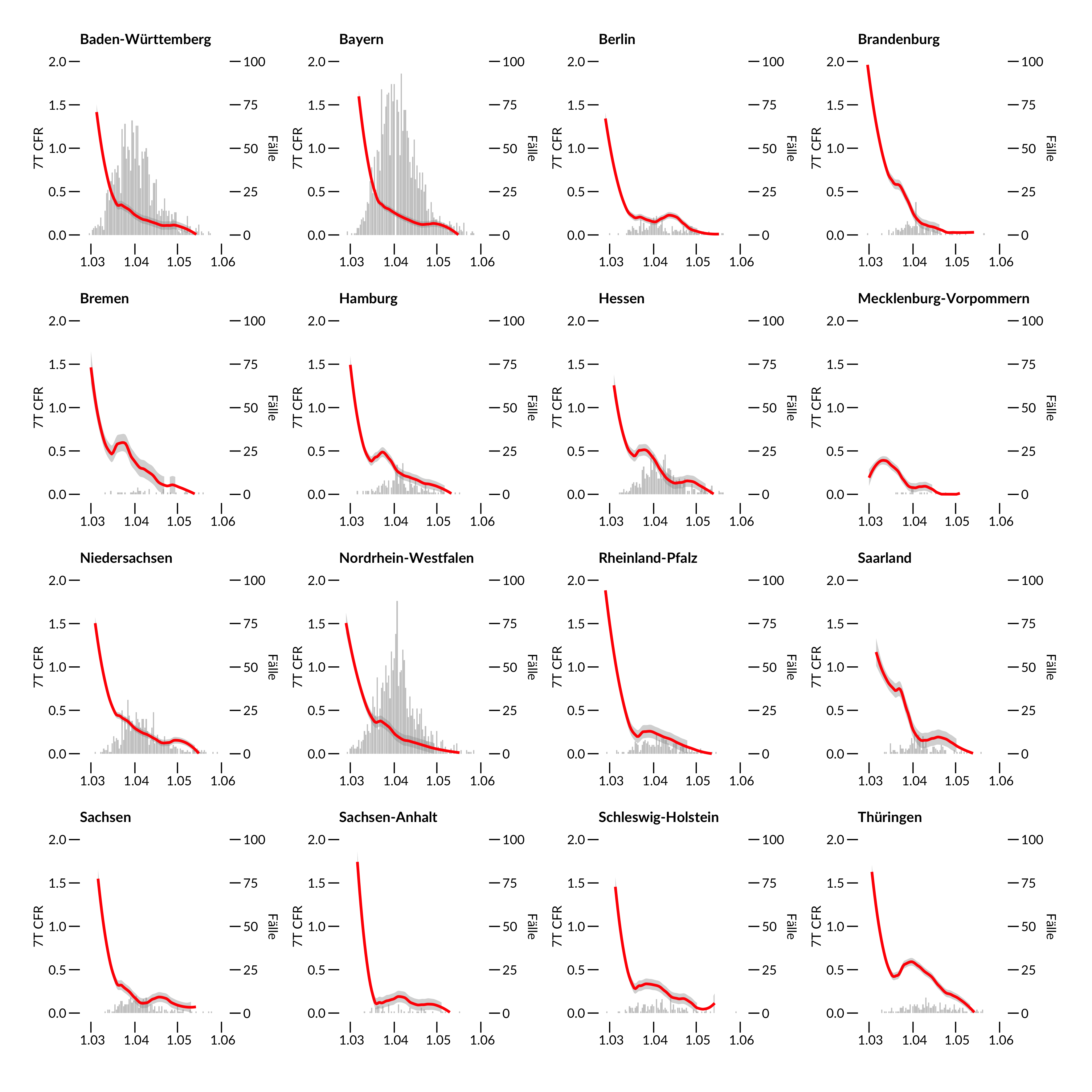
Hier kommt ein Plot der Case Fatality Ratio nach Bundesländern. Warum sinkt eigentlich die CFR, obwohl der Virus doch überall gleich tödlich ist?
Infection Fatality Ratio (IFR, rot) definiert als kumulative Sterblichkeit innerhalb eines 7 Tage Zeitfensters das 14 Tage auf das 7 Tagesfenster der Meldung um den Indextag folgt. Fallzahlen hinterlegt in grau für den jeweiligen Indextag. Sliding Window mit Loess Smoother span=0.5. Für Definitionen siehe https://www.heise.de/newsticker/meldung/Zahlen-bitte-3-4-Coronavirus-Fallsterblichkeit-False-Number-4679338.html bzw https://www.rki.de/DE/Content/InfAZ/N/Neuartiges_Coronavirus/Steckbrief.html Datenstand: RKI 4.6.2020
Am Anfang der Pandemie waren die bestätigten Fälle selten, da nur begrenzt PCR Tests zur Verfügung standen, die CFR wird also massiv überschätzt. Dann steigt die Zahl der durchgeführten Tests, am Ende der Epidemie geht die CFR wieder herunter, da es auch keine Sterbefälle mehr gibt.
In dem Verlauf zwischen dem 15.3. und 15.4. könnten allerdings auch “echte” Faktoren eine Rolle spielen, etwa eine Lernkurve in den Kliniken, dass Patienten besser behandelt werden. Es könnte aber auch ein positiver Effekt durch die Maske sein, dass zum Beispiel Infektionen mit geringeren Virusmengen weniger tödlich verlaufen. Oder als ein weiterer positiver Effekt, dass durch Kontaktbeschränkung weniger Gefahr durch Super Spreader droht.
Was davon stimmt, kann nur über neue Studien herausgefunden werden. Der Zeitverlauf zeigt jedenfalls, dass man die CFR sinnvollerweise erst am Ende einer Pandemie bestimmt.
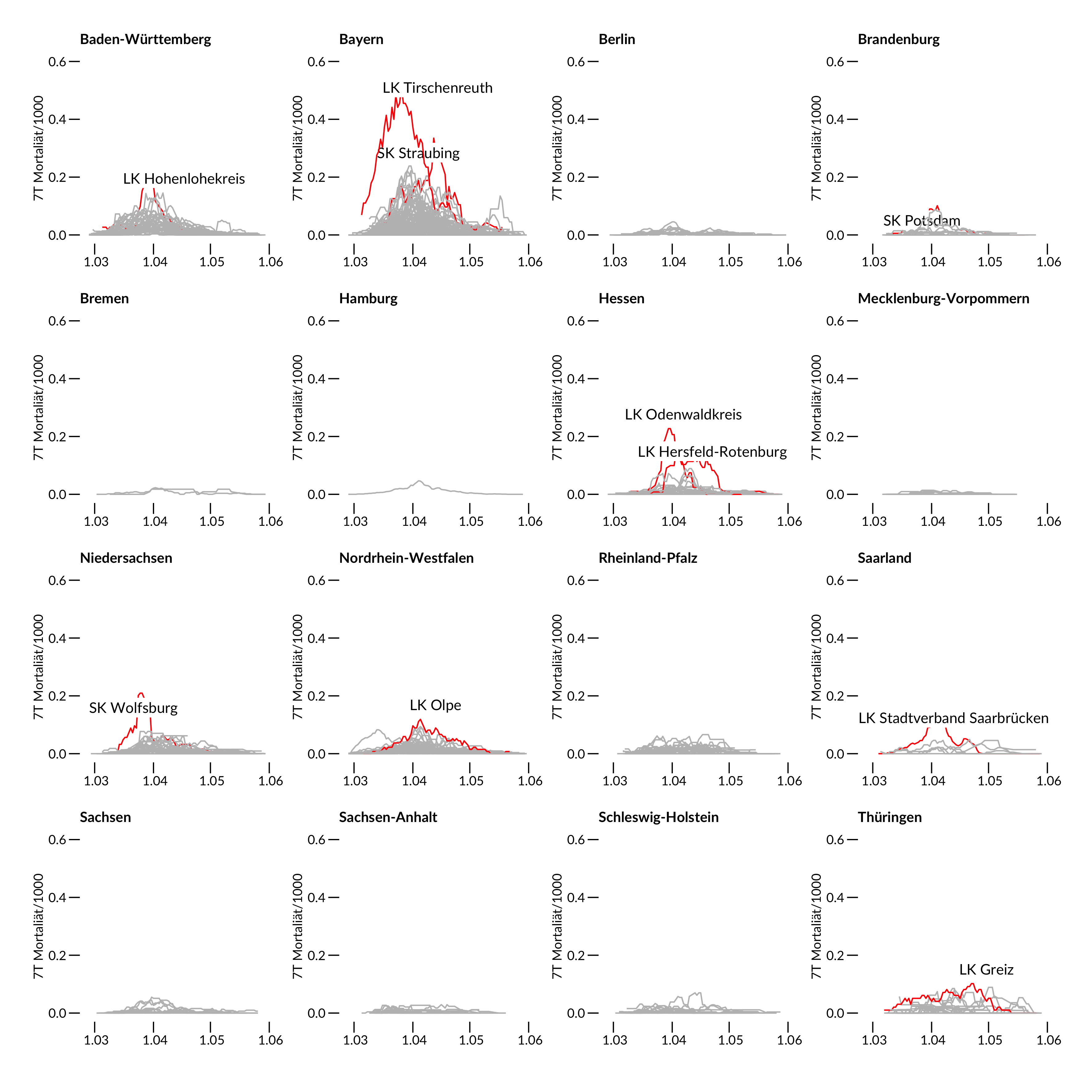
Schauen wir uns noch einen Plot der Mortalität in den Landkreisen an.
Mortalitätskurven (rot) definiert als kumulative Sterblichkeit innerhalb eines 7 Tage Zeitfensters um den Indextag bezogen auf 1000 Einwohner des jeweiligen Land-/Stadtkreises. 412 Kreise wurden dafür ausgewertet. Rot zeigt die jeweiligen Spitzenreiter des Bundeslandes an. Datenstand: RKI 4.6.2020.
Am stärksten betroffen sind Baden-Württemberg, Bayern und Nordrhein Westfalen, wobei bei den Landkreisen aber nicht Gangelt/Heinsberg sondern Mitterteich/Tirschenreuth den Spitzenplatz einnimmt.
Heute verschwindet Heinsberg und Tirschenreuth von der Corona Karte, wenn man die neue Definition “Neuinfektionen der letzten 7 Tage” nimmt. Ein grosser Erfolg der Massnahmen vor Ort.
Neu im Club dafür sind Greiz (Familienfeiern), die drei Schlachtereien Pforzheim Müller Fleisch, Coesfeld Westfleisch und Bad Bramstedt Vion, Esslingen war es eine Beerdigung, Neuburg eine Asylunterkunft, Rosenheim und Traunstein sind Altfälle von den Starkbierfesten.
The Gangelt study that surfaced this morning is interesting as it includes now some sound statistics using GEE models to account for household clustering (in a previous interview the lead author denied the value of statistical models). The PDF is only available an internal university server without any doi number and timestamp – not even a “preprint” at all.
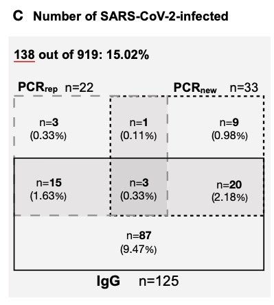
Maybe I am a bit disappointed as it remains basically a cross-sectional analysis, without any virus phylogeny, ct values and without any description if and how containment measurements were followed under lock-down conditions. Although being performed at a hotspot, PCR results are not particular exciting. 439/12597=3.4% as measured by official surveillance and 33/919=3.6% as measured by the authors.
The claim to fame (besides some annoying reports about the accompanying PR campaign that made it even into Science magazine) are those 15% antibody positive results. Everything in this paper depends on the IgG antibody specificity to Sars-Cov2. It is reported
as of April 7, 2020, validated in cooperation with the Institute of Virology of the Charité in Berlin, and the Erasmus MC in Rotterdam, Euroimmun, Lübeck, Germany). The data sheet (April 7, 2020) reports cross-reactivities with anti-SARS-CoV-1-IgG-antibodies, but not with MERS-CoV-, HCoV-229E-, HCoV-NL63-, HCoV-HKU1- or HCoV-OC43-IgG antibodies.
which is a bit weak regarding current pre-test standards, neither in terms of selection of samples, numbers and reporting. The press briefing even adds more confusion
as this reference is not cited in the preprint. I assume it is the Lassaunière comparison (medRxiv preprint) that showed a specificity of 96% only which is n o t s o good with the low prevalence expected.
posted April 10 (downloaded May 5) https://www.medrxiv.org/content/10.1101/2020.04.09.20056325v1
A further study on medRxiv reported a specificity of 99% using a “well-defined specificity panel of 147 serum and plasma samples” without any further description. Seroconversion data would also been helpful from Gangelt – why are those N=9 in the figure below not being retested after 2 weeks?
Unfortunately all consecutive plots stratify for infection rate only (combining IgG+ and PCR+) but do not show if the significant difference between carnival / no carnival is due to IgG+. Did IgG+ probands suffer from more symptoms? Why do the co-morbidities not show up here as in many other studies? Why is there such a low household secondary infection rate although the initial transmission is so high?
The contact persons outside of the household are ignored. Unfortunately, the paper also does not show the data promised in a previous interview, for example data on drug use, seating arrangement at the festival, infection chain and association with school closing at the end of January. Will that be published only as salami sliced?
Compared to the April 9 report, based on 500 study participants there are also major discrepancies
– the number of inhabitants in Gangelt increased by 68 for whatever reason
– Forsa is no more mentioned in the acknowledgment
– the percentage of PCR+ individuals was previously given as 2% but is now reported to be 3.6%. Either the first figure was completely wrong, or the additional 419 individuals must have contributed a phenomenal 5,5% PCR+ rate.
– the preliminary case fatality CFR was 0.37% based on 7 individuals. This figure remained unchanged even when moving to infection fatality IFR that should be lower as the denominator increased with more infections. Patients also continued to die after the end of the observation period, making the IFR estimate unreliable if not expanded by the 14-21 day usual symptom to death interval.
I tried to validate those 7 deaths reported in the manuscript for Gangelt until March 30. RKI reports 55 in the district Heinsberg until March 30. Did most of them really happen outside Gangelt?
According to the official statistics of the state department we may expect 11 deaths per month in Gangelt. So with the 7 reported cases we should find 18 cases by the end of March. According to the website https://www.aachen-gedenkt.de there are, however, 21 obituaries found in Gangelt eg 3 more than expected. Maybe there are some errors in my re-analysis as the obituaries do not always give the last address or not each death results in an obituary but we can assume that there was at least an excess of 10 and not only of 7 cases until March 30. For a final estimate we need to add at least 1 more case who died after the end of study. My estimate therefore is at least 11 and not just 7 cases.
– Why have the death certificates not been verified in a paper that has even “infection fatality rate” in the title?
– Why are there no virus tests in the victims?
There are few more but less important issues
– it does not make sense in Figure 5 for 1 person to be infected by 1 person
– the prevalence of 107 lung diseases in table 1 is wrong with the given percentage
– the “officially reported cases for this community 3.1%” in the abstract contradicts Fig 1A which gives 439/12597 or 3.5%
– a non responder survey is missing in particular as previously PCR+ individuals were underrepresented. Although not directly reported in the paper, I calculate the response to 407/600=67.8% which is acceptable but not top class.
Taken together, it seems that the study leaves us with a lot of open questions. What is the functional relevance of this particular Ig G+? Is there any Ig G+ reinfection? What do the N=20 in the diagram 2C mean – chronic carrier, false positives, re-infected patients?
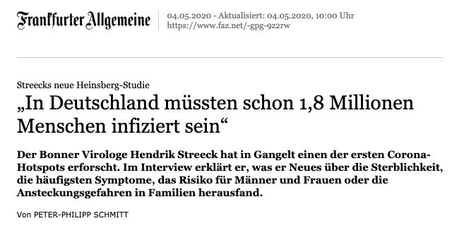
The new FAZ headline published in parallel is clearly unwarranted as hotspot data can not be extrapolated.
15% of 81 Million infected? Only now I get the argument: the authors increase their infection rate from 15% to 20% due to some non-participation, then use the IFR based on 7 cases, relate it to the number of German inhabitants to obtain the number of infected ones in Germany. Breathtaking!
Commentary: While I think, it is fine to post a preprint ahead of a publication, this is not even a preprint, it is just a copy of a manuscript on a university server. Using this copy to legitimate a FAZ headline, means that the information released here can no more retracted. It will influence politics, it will influence the live of millions of people. It also means: peer opinion is not relevant for somebody who talks to the press without any peer comment. Streeck hat been warned after publishing the interim report while circumventing again standard procedures in science, means this is a misuse of science as pretext.
6.5.2020 UPDATE
Two fun facts – the person in table 1 was probably so drunken that s/he does not even remember carnival ;-) The press briefing reporter obviously did not understand the difference of essay and assay :-)
Drosten about the study in his podcast “a little bit too high”, “would have analyzed in a different way”, “no raw data” …
lockdown to control until vaccine “not feasible” 22:27 and argues for “viral low dose”
Sahm / FAZ complained about the confidence interval.
The current IFR in the USA is not 0.36% but 1.3% (95% CI: 0.6% to 2.1%) with county-specific rates varied from 0.5% to 3.6% according to Basu 2020. With a correct figure of 11 deaths out of 15/100 * 12.000 in Gangelt, the IFR is 0,61% and compatible with the lower end of the US distribution,
11.5.2020 UPDATE
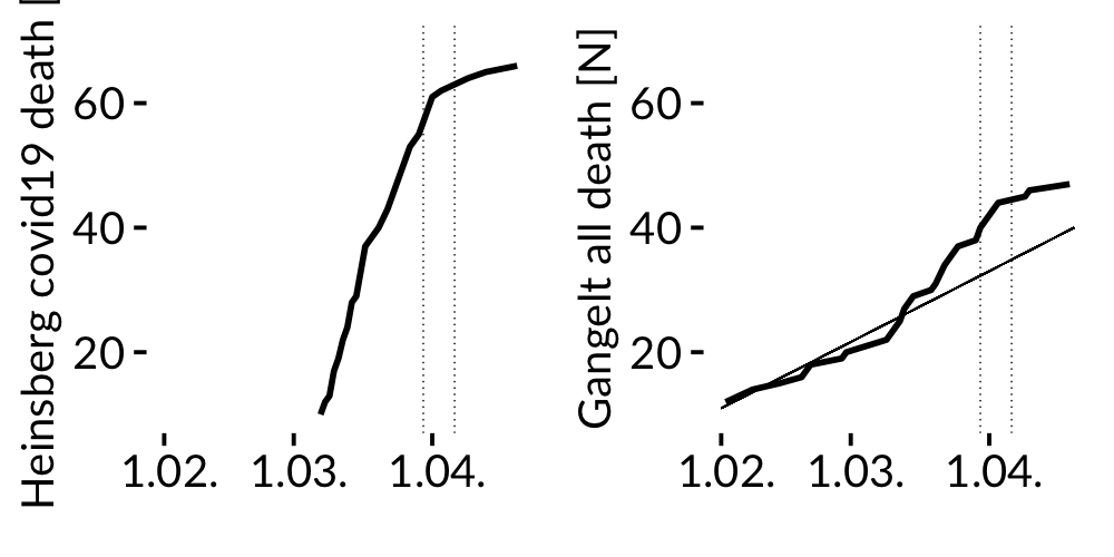
mortality figure Heinsberg / Gangelt
LEFT FIGURE Cumulative number of covid19 death in the district of Heinsberg according to RKI data shows a sharp increase of deaths in March. Cumulative number of all death in Gangelt according to an own analysis of all obituaries from January to April 2020 as reported in the local newspaper for Gangelt in the RIGHT FIGURE. The thin straight line indicates the 18 year average death count in Gangelt according to official NRW statistics 2000-2018 (with on average of 11 deaths per month). Vertical lines give the examination period of the Gangelt study. Death rate is obtained by obituaries using “Gangelt” in the announcement. Without official data confirming the home address of the case fatalities in Gangelt, the number of deaths obtained by obituaries could have been slightly overestimated as sometimes the home address is given by the funeral office only; on the other hand cases without any obituary would have left to an underestimate. Taken together the right plot shows an excess of 10 deaths on April 4. If we add another death after the observation period, there are 11 deaths instead of 7. Data available on request.
screenshot of my local obituary database
According to official RKI data about 15% of all Covid-19 related deaths in the district occurred in Gangelt although only 5% of the population of the Heinsberg district is living there.
The average all cause death in Gangelt doubled in March when compared to years 2000-2018.
Summary: The excess number of deaths in Gangelt by the end of the study is much higher than reported in the manuscript.