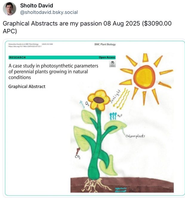
I see all these graphical abstracts in Elsevier papers along with instructions like “please use Times, Arial, Courier or Symbol font”. The intention behind these drawings is probably a “cut & paste template” for busy congress speakers. Or some social media ads. But there are arguments against this practice.
The strong argument: It is the task of a speaker to carefully read an article, find out out strengths and weakness, and put the results into context. Just cut & paste a graphical abstract is inacceptable.
And there is another argument: As drawn by lay people, most of these graphical abstracts are ugly, hard to understand and biased. They often steal ideas and concepts, making art directors, illustrators and typesetter unemployed.
For a more in depth analysis see an essay by Nico Pitrelli...
added 11 Aug 2025
no words required
