Here is the R sample code (PPT aspect ratio is 6:4, Youtube wants 16:9) .
As ggplot2 animation packages have major difficulties to manipulate the single frames, I am combining here raw PNGs using ffmpeg.
# read_cru_hemi() modified from https://mccartneytaylor.com/plotting-climate-change-on-a-spider-graph-using-r

list.of.packages <- c("ggplot2", "reshape", "stringr","RColorBrewer")
new.packages <- list.of.packages[!(list.of.packages %in% installed.packages()[,"Package"])]
if(length(new.packages)) install.packages(new.packages)
lapply(list.of.packages, require, character.only = TRUE)

read_cru_hemi <- function(filename) {
  tab <- read.table(filename,fill=TRUE)
  nrows <- nrow(tab)
  hemi <- data.frame(
    year=tab[seq(1,nrows,2),1],
    annual=tab[seq(1,nrows,2),14],
    month=array(tab[seq(1,nrows,2),2:13]),
    cover=array(tab[seq(2,nrows,2),2:13])
  )
  hemi[,15:26][ hemi[,15:26]==0 ] <- c(NA)
  return(hemi)
}

url_dat <- "https://crudata.uea.ac.uk/cru/data/temperature/HadCRUT4-gl.dat"
tempdat <- read_cru_hemi(url_dat)
tempmelt <- melt(tempdat[,c(1,3:14)],id="year")

colfunc <- colorRampPalette(c("grey","grey","red"))
FadeToGrey <- colfunc(2019-1850)

new_theme <- theme_classic() + theme(
  text = element_text(size=18, colour="grey"),
  axis.line = element_blank(),
  axis.text = element_text(colour="grey"),
  axis.ticks = element_line(colour="grey"),
  axis.title.x = element_blank(),
  panel.border = element_blank(),
  panel.grid.major = element_blank(),
  panel.grid.minor = element_blank(),
  panel.background = element_blank(),
  legend.position = "none"
)
theme_set(new_theme)

for(i in 1850:2019){
p <- ggplot(tempmelt[tempmelt$year %in% 1850:i,], aes(x=variable,y=value,color=as.factor(year),group=year)) +
  geom_line() +
  scale_x_discrete( labels=month.abb) +
  scale_y_continuous( name="difference from baseline  [ oC ]", limits=c(-1,1) ) +
  annotate("text", x=11, y=1, label=i, size=7) +
  scale_color_manual( values=FadeToGrey[ 1:c(i-1849) ]  )
  fn <- paste("/Users/xxx/Desktop/X/",str_pad(i-1849, 3, pad = "0"),".png",sep="")
  ggsave(p, file=fn, width = 16, height = 9)
}

# not run
# ffmpeg -framerate 10 -i /Users/xxx/Desktop/X/%3d.png -r 5 -pix_fmt yuv420p -y /Users/xxx/Desktop/X/out.mp4
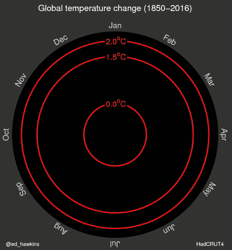
In comparison here is the original circular plot. Would require blue, green, yellow, red in the Color Ramp Palette…
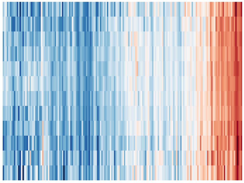
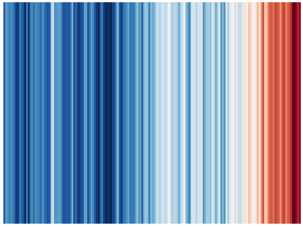
Now it is only a minor step to the warming strips.
ggplot(tempdat, aes(x = year, y = 1, fill = annual))+
  geom_tile()+
  scale_y_continuous(expand = c(0, 0))+
  scale_x_continuous(expand = c(0, 0))+
  scale_fill_gradientn(colors = rev(col_strip)) +
  guides(fill = guide_colorbar(barwidth = 1)) +
  theme( axis.ticks= element_blank(),
         axis.text = element_blank(),
         axis.title = element_blank()
  )

tempmelt$variable <- as.numeric(str_replace(as.character(tempmelt$variable),"month.",""))
ggplot(tempmelt, aes(x = year, y = variable, z = value)) +
  geom_raster(aes(fill = value)) +
  scale_fill_gradientn(colors = rev(col_strip)) +
  scale_x_continuous(expand = c(0,0)) +
  scale_y_continuous(expand = c(0,0)) +
  theme( axis.ticks= element_blank(),
         axis.text = element_blank(),
         axis.title = element_blank()
  )
CC-BY-NC Science Surf , accessed 05.04.2026