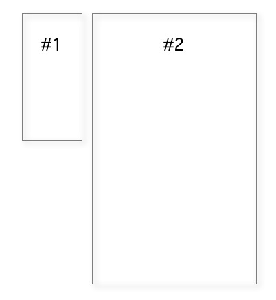
In my picture gallery I show two divs side by side. Div1 is variable and needed only on a few pages. Div2 is large, complicated and takes quite some time to load as there are numerous pictures and jquery actions.
Rather simple setup, isn’t it? The rendering should be smooth (both divs loading at final position and not jumping around at the end of page loading) and fluid (working on smaller devices as well) and without any dynamic stylesheet language.
This simple task turned out to be complicated. I started with that
div1 {
    width:200px;
    float:left;
}
div2 {
    width:1200px;
    float:left;
}
Forget about that, as it renders div2 under div1 on small screens. What about an extra wrapper?
</pre>
<div>...
<div style="clear: both;"></div>
</div>
<pre>
Not useful at all, I even do not understand the whole concept. So I tried to replace the float with something like
display: inline-block;
vertical-align: top;
Fancy, this wrapping of divs but still not what I wanted. Should I do some media query first?
@media all and (max-width: 800px) {
  div1 {
    width:...
but no chance for some useful code as the div1 is not always there. I could, however, use also some relative width
div1 {
    width:10%;
    float:left;
}
div2 {
    width:90%
    float:left;
}
Not bad, but it heavily compresses the first div on smaller screens. So I added
div1 {
    width:10%;
    min-width:200px;
    float:left;
}
..
Nearly there, but as said before, I do not always have a div1. Maybe that will help
$(document).ready(function() {
  if ( !$( "div1" ).length ) {
    $("div2).width('100%');
  }
)}
I hate it, to say that this animation is still somewhat strange. So I dropped all div positioning,
and wrap the div1 into <td> tags whenever a div1 exists.
<table>
  <tr>
    <td valign="top" width="10%"><div id="div1"></div></td>
    <td valign="top" width="90%"><div id="div2"></div></td>
  </tr>
</table>
Uhh. Until today, I thought programming is something rational and predictable, yea, yea.