The amyloid analysis published in Nature has been commented at PubPeer and also earned a commentary of Charles Piller in Science. His “Blots on a field” news story is leading now even to an expression of concern by Nature.
The editors of Nature have been alerted to concerns regarding some of the figures in this paper. Nature is investigating these concerns, and a further editorial response will follow as soon as possible.
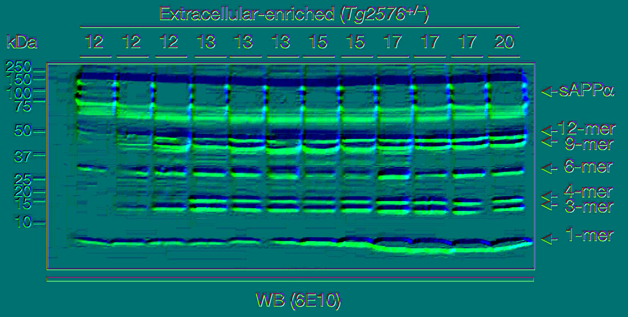
IMHO there are many artifacts including horizontal lines in Fig 2 when converting it to false color display. I can not attribute the lines to any splice mark and sorry – this is a 16 year old gel image, (Basically an eternity has passed in terms of my own Nikon history with 5 generations from D2x to Z9) So don’t expect any final conclusion here as long as we cannot get the original images here.

Similar bands are worrying of course, but as Ashe writes on PP “bands that migrate close to each other may differ in intensity but appear similar in shape”. Unfortunately the Piller article did not respond to this argument raising doubts not only on the original Lesné paper but also on the Schrag analysis presented in Science.

According to Piller Schrag had only 4 weeks of PP experience with image analysis and is using a method of Western blot alignment that has never been validated before – most likely a manual analysis of largely undocumented pixel shuffling.
As Schrag did not respond to my email for technical details, I am trying now to repeat his analysis. So we read the images first and find the contours of the bands.

im = cv2.imread( "schrag.jpg") # I am not adjusting background to keep the image as natural as possible # im = cv2.pyrMeanShiftFiltering(im, 25, 70) # converting to grayscale and applying threshold im = cv2.cvtColor(im, cv2.COLOR_BGR2GRAY) thresh = cv2.adaptiveThreshold(im,255,cv2.ADAPTIVE_THRESH_MEAN_C, cv2.THRESH_BINARY,101,10) # find contours contours, _ = cv2.findContours(thresh, cv2.RETR_LIST, cv2.CHAIN_APPROX_NONE) for i in range(len(contours)): x,y,w,h = cv2.boundingRect(contours[i]) out = im[y:y+h,x:x+w]

We then focus on the most distinct two bands on the right, correct their size and adjust contrast as done by Schrag.
# change crop to make out1 comparable to out2 # compressing eg cv2.resize(i2, (h,w), interpolation = cv2.INTER_AREA) seems to invasive out1 = out1[0:32,2:175] h,w = out1.shape # Michelson contrast def getcontrast(im): min,max =(int(np.min(im)),int(np.max(im))) return( (max-min)/(max+min) ) print( getcontrast( out1) ) # 0.31 out2 = cv2.addWeighted(out2, 1.2, out2, 0, -50) print( getcontrast( out2) ) # 0.33 which is acceptable # display both bands im = np.ones([w,h,3], dtype=np.uint8) im[:,:,0] = 255-out1 plt.imsave("out1.jpg", im) im = np.ones([h,w,3], dtype=np.uint8) im[:,:,1] = 255-out2/0.5 plt.imsave("out2.jpg", im) # heatmap seems overkill to me but Spearman's R is nice to know r,_ = stats.spearmanr( im[:,:,0].flatten(), im[:,:,1].flatten() ) print(r) # 0.92 # no change also after combining neighboring pixel im = cv2.resize(im, (int(w/4), int(h/4)), interpolation=cv2.INTER_NEAREST) stats.spearmanr( im[:,:,0].flatten(), im[:,:,1].flatten() )
These are the colorized bands basically as doen by Schrag. There is no need to construct the red + green = yellow overlay as the bands are clearly different. Anyway here is it just for completeness.
So I can’t replicate the results here – neither the high correlation coefficient nor the shape of bands . There are also no splice marks although there should be some if Lesné would have used version Photoshop CS2 (9.0) at that time.
Is my alignment wrong? In don’t think so by visual eyeballing. Also comparing a larger area doesn’t change so much.
Keypoints also do not match, excluding largely any scaling and alignment issue.


Of course I have also serious doubts on many Lesné images including the duplication identified by Elisabeth Bik shown under #15.
Verdict: It seems that Piller has again produced one of his dubious stories in a situation where clear answers would be urgently needed.